Is it True?
Is it Kind?
Is it Necessary?
Does it improve upon Silence?
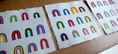
Looks like rainbows, the drawings are a practice of both concepts - color relationships and social clarity.
 |
| click on the image to see it larger. |
This
past weekend, I had the opportunity to do another piece referencing the
latter. I participated in Rick Griffith's printing workshop at Matter Studio, wherein we learned how to use printing presses and typeset and
were challenged to create a design for print. I did a print about the 4
doorways and also a print quoting Haruki Murakami from his book, The Wind Up Bird Chronicle. "All you had to do was sit still for ten minutes, and you could see this amazing variety of grays." the 4 doorways shape and the "cloud" shape I designed to be made into printing blocks set alongside type. One of my workshop-mates, Michelle, had a set of modular type that she intuited I might like to use, how very thoughtful and true, so the 4 doorways print uses those (outside of the modular purpose - re-imagining the modular elements as letters themselves). The Murakami print uses lead-type 42pt Helvetica.
I loved working with Rick at Matter and using his presses this weekend. I love the work that I did.
Last comment: Below, a drawing/paper-cutting by Brittany Gould (Denver artist) that I recently collected entitled, Over Charleston.
 |
| it's worth it to click on this image and look at it larger. |


No comments:
Post a Comment